Guidelines
Brand Toolkit
Need to use some of Travelport’s brand elements? Our brand team are sticklers for the rules, so please follow these guidelines if you need to use our logo or other assets.
Logo
Our logo has been custom designed and is unique to us. It plays a central part in building Travelport’s brand recognition.
It consists of the logotype and symbol arranged in a lock-up. Please don’t recreate them or change the relationship between the two elements.
The logotype may never be used on its own without the symbol.

Logo
Exclusion Zone
Protect our brand by ensuring there is enough clear space around the logo on every application. The minimum clear space equals the diameter of the symbol roundel, as shown here.
Make our logo shine by allowing ample clear space. Don’t feel the need to fill a space with the logo, size doesn’t necessarily equate to impact or legibility.
Give the logo room to breathe.
Clear space

Logo
Colourways
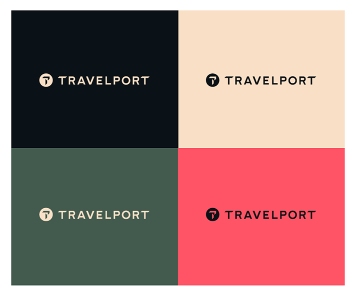
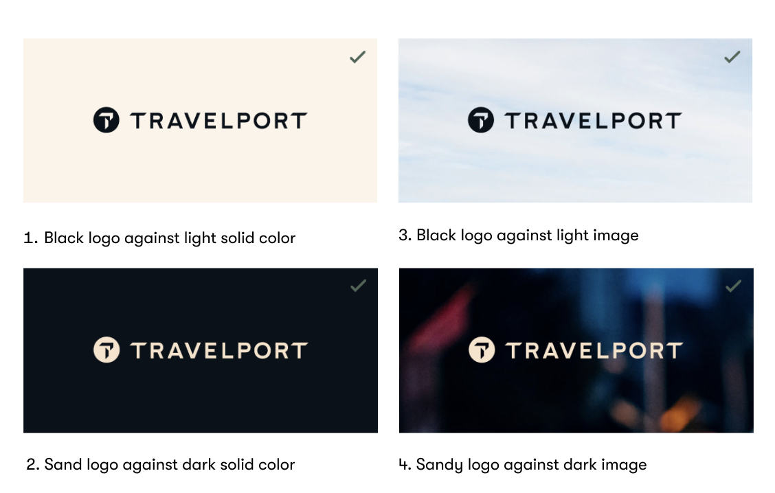
Our logo should only appear in just two colors, either Travelport Black or Travelport Sand. Always choose the most legible option when using against solid color or imagery.
Logo
Positioning
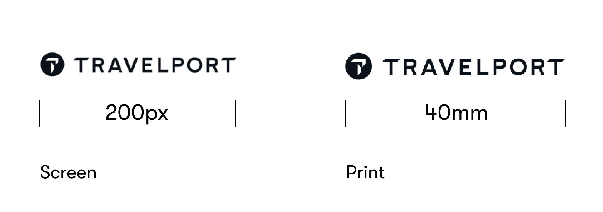
The Travelport logo can be positioned in a number of ways depending on the context. It is important to keep the logo at a scale suitable for the format.
Below are some examples of where you might position the logo, and how the positioning might change depending on its intended use.
The the placement of the logo can change, but please make sure that the position and size is appropriate for your document.
Give the logo plenty of clear space and don’t allow it to fight with other information.
Centred

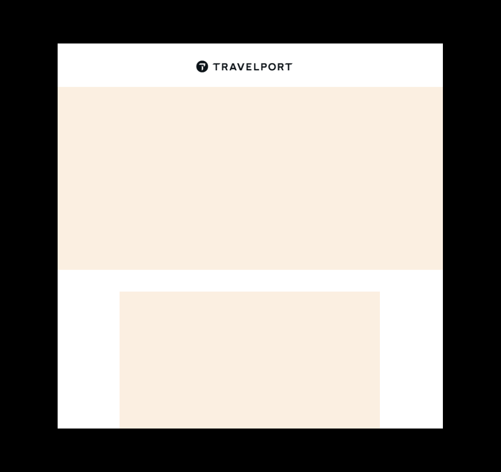
Example: On the website menu bar it makes sense to lead with a centred Travelport logo.
Aligned top left

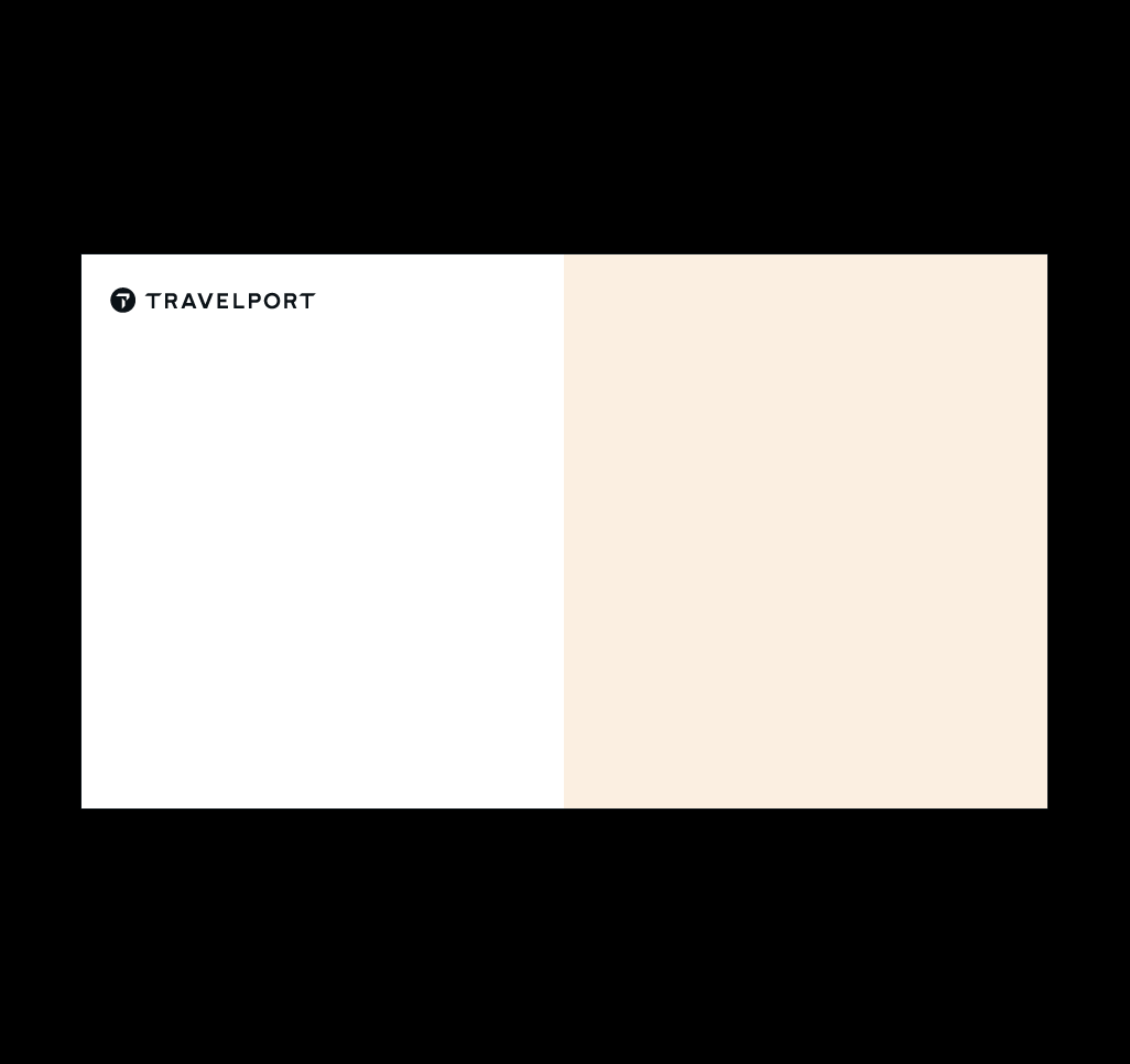
Example: On presentations and document covers where you need space for a title underneath.
Aligned bottom right
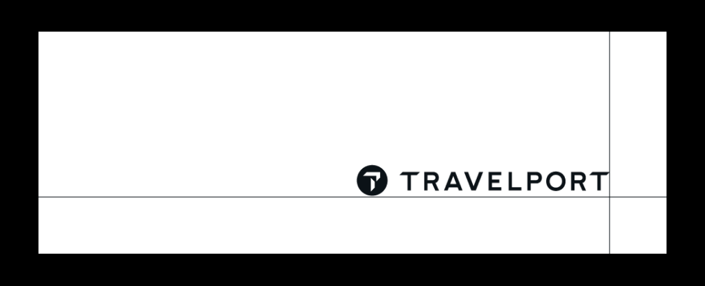

Example: On print ads where it makes sense to sign-off with the Travelport logo
Logo
Usage
Protect our brand by ensuring our logo is displayed within these guidelines. Do not manipulate the logo in any way and make sure it is always legible.
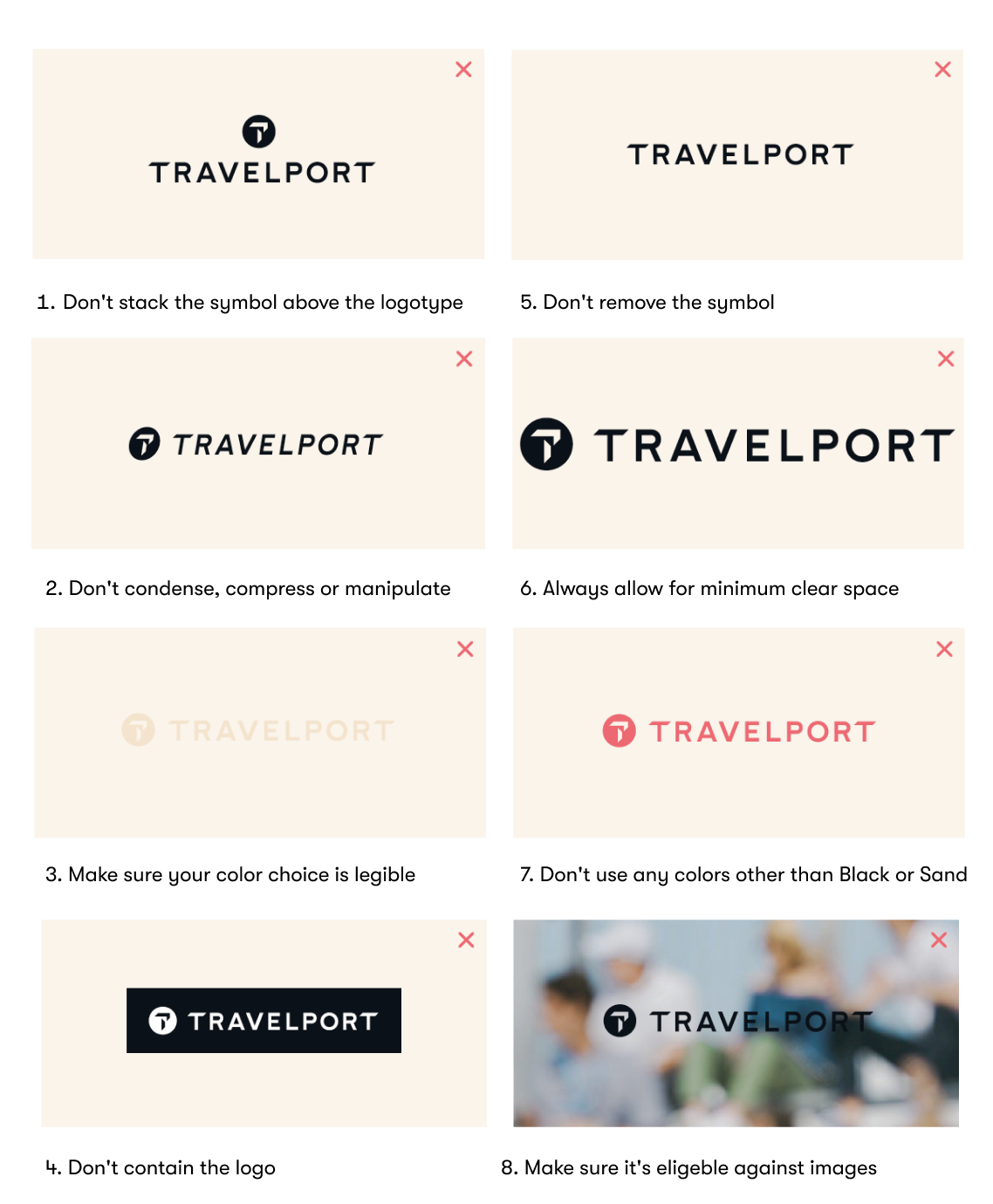
If you are an Official Partner of Travelport please refer to the Partner Branding Guidelines for detailed direction on how to brand Travelport Partner’s materials. For a copy of the relevant document, please contact operatormarketing@travelport.com
Color
Primary Brand Palette
Travelport Sand and Travelport Soft Black provide the basis for our unique color palette.
They should be the predominant colors in any application.
SECONARY BRAND PALETTE
Secondary colors
Accent color
Tints
Where flexibility is required, for instance on charts or graphs, it is permissible to use tints.
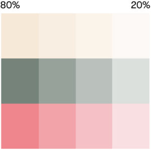
Printing Travelport colors will look better on an uncoated or silk stock. Where lamination is necessary, please use a matte finish where possible.
If you require any other brand assets or have a questions on how to use our logos or colors please contact the Brand team brand@travelport.com
